Take Five App
An online tool designed to help children recognize and understand their emotions. The app aims to teach them healthy strategies for managing their feelings, promoting emotional awareness and resilience in a fun and engaging way.
Role
As the UX Designer, I led the design of the Take Five app and its responsive website from conception to delivery. My key responsibilities included conducting user interviews, creating paper and digital wireframes, developing low- and high-fidelity prototypes, conducting usability studies, ensuring accessibility, iterating on designs, and overseeing information architecture and responsive design.
The Problem + Product Goal
Children often experience intense emotions but struggle to express or understand them. They may not know what triggers their reactions or how to manage these feelings. The goal was to design an app and responsive website that helps children identify and understand their emotions through daily check-ins, interactive videos, and engaging games.
Target Audience
The target users are children between the ages of 5 and 12 who need help understanding their emotions. These children often struggle to identify what they’re feeling and why, and the app aims to provide them with the tools to better recognize and manage their emotional responses.
User Research
Through user interviews, I discovered that many children and pre-teens were experiencing significant life changes, which brought complex emotions they had difficulty processing. Additionally, teachers and parents expressed a need for resources to help support their children in navigating these emotions and encourage open conversations about emotional expression. The feedback gathered from this research highlighted the importance of creating an easy-to-access, interactive app that would help children identify and understand their emotions while providing a space to pause and regroup.
User Journey
Design
Sketching a Solution
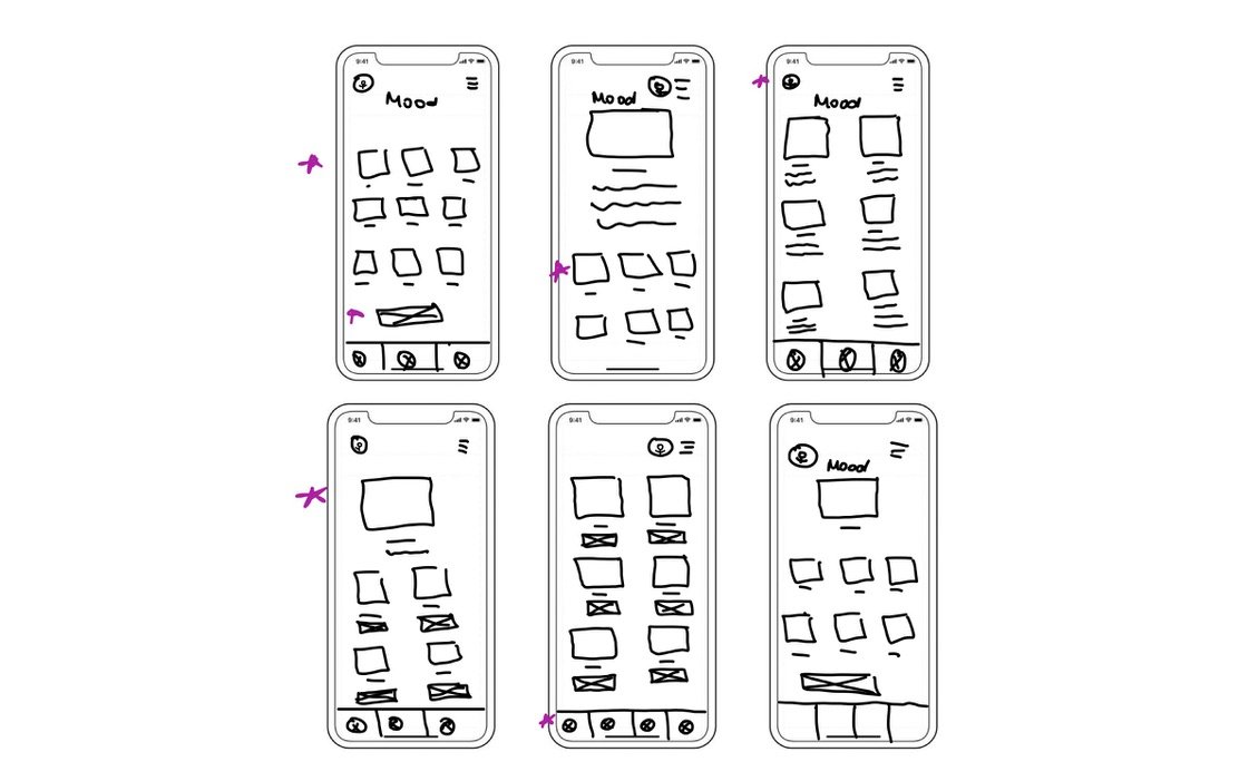
During the ideation process, I began by drafting and iterating on each screen. Shown to the right are the low-fidelity sketches for the daily check-in/mood page, which were designed to help children track and reflect on their emotions each day.
The stars signify the features that I liked for the final sketch.
Low Fidelity Digital Wireframes
I transitioned the lo-fi wireframe sketches into digital designs using Figma. These wireframes focused on building emotional awareness and helping users gain insight into their feelings. Below are the mobile app wireframes, which illustrate the core features and user flow for tracking and understanding emotions.
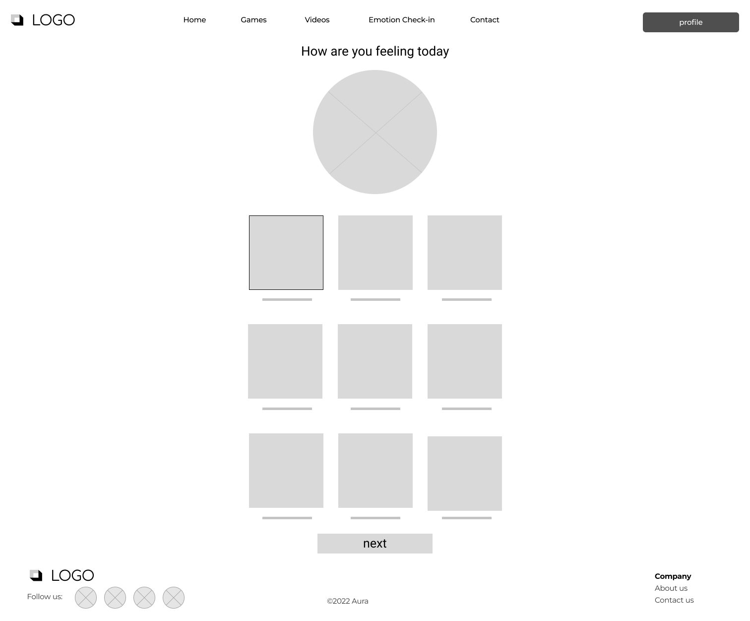
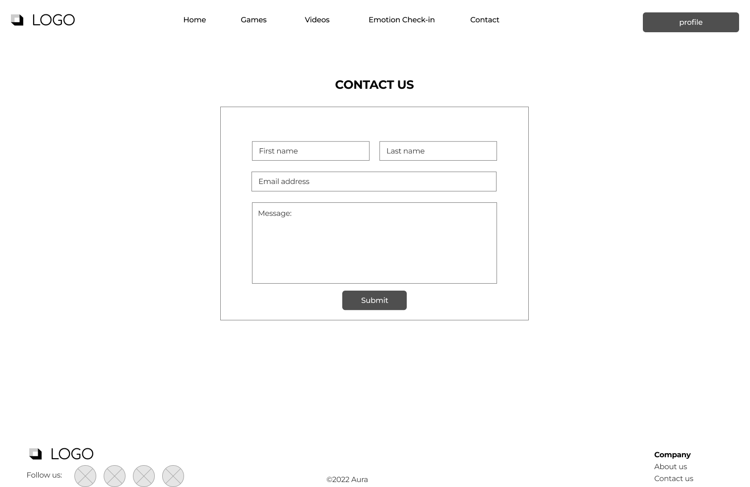
Responsive Desktop Low Fidelity Digital Wireframes
High Fidelity Mockups
Using Figma, I transformed the low-fidelity wireframes into high-fidelity mockups, refining the design with detailed visuals, typography, and color schemes. These mockups bring the app to life, ensuring it is visually engaging and user-friendly for children while maintaining its educational purpose.
Color Palette
When designing the mobile app and responsive desktop version, my goal was to create a vibrant and engaging experience for children. The colors chosen were fun and lively, aligning with the app's playful theme. These bright, cheerful colors were selected to capture the attention of young users while creating an inviting and positive atmosphere for emotional exploration.
Typography
For the typography, I chose Mali for the logo and headings to add a fun, playful touch that appeals to children. For the subtext, I used Inter, a clean and highly readable font, ensuring that the text is easy to read and contributes to the app’s overall user-friendly design.
High Fidelity Prototype
Takeaway
Throughout this case study, I learned the importance of breaking down a complex problem into manageable steps. This approach allowed me to address each issue more effectively, avoiding feeling overwhelmed. I also realized the value of embracing each iteration with an open mind, continuously improving while keeping user needs at the forefront. Overall, I thoroughly enjoyed working on this project and believe that educating young people about emotions and empathy is a meaningful and impactful cause.


