Revive Bakery + Cafe
Through extensive research, design, and branding, I created a responsive website that aligned with Revive Bakery + Cafe’s new business goals. The site was designed to not only reflect the brand's vision but also build a strong sense of community and connection with their customers.
Role
As the UX/UI Designer, my responsibilities included conducting user interviews, creating paper and digital wireframes, developing low- and high-fidelity prototypes, conducting usability studies, ensuring accessibility standards, and iterating on designs based on feedback.
The Problem + Product Goal
Revive Bakery + Cafe is a small, local bakery looking to build a stronger online presence and expand their business. The goal was to design a website that not only aligns with the business’s goals but also enhances the user experience. The website's primary feature is to allow customers to order ahead, helping them avoid long lines and make the process more convenient.
Target Audience
The target audience for the website consists of busy individuals aged 18 to 60 who value convenience and don’t have the time to wait in long lines. These users are likely professionals, parents, and students looking for a quick and efficient way to place their orders ahead of time.
User Research
During the research process, I conducted user interviews to better understand user needs. A key user group identified was working adults who enjoy grabbing coffee or pastries but find the long wait times inconvenient. This insight helped shape the design to better serve their busy lifestyles.
Major Pain Points
Time Constraints: Working adults often have limited time to stop for coffee or pastries, making quick service essential.
Dietary Restrictions: Users prefer to review the menu online to easily identify any dietary restrictions or options that meet their needs.
Customization: The ability to customize orders via a mobile app is more efficient and convenient than ordering in person, allowing for a smoother experience.
User Journey
Sitemap
I created a sitemap to define the overall structure and content of Revive’s website, ensuring a logical and intuitive navigation experience for users. This blueprint helped organize key pages and features in a way that aligns with user needs and enhances usability.
Design
Sketching a Solution
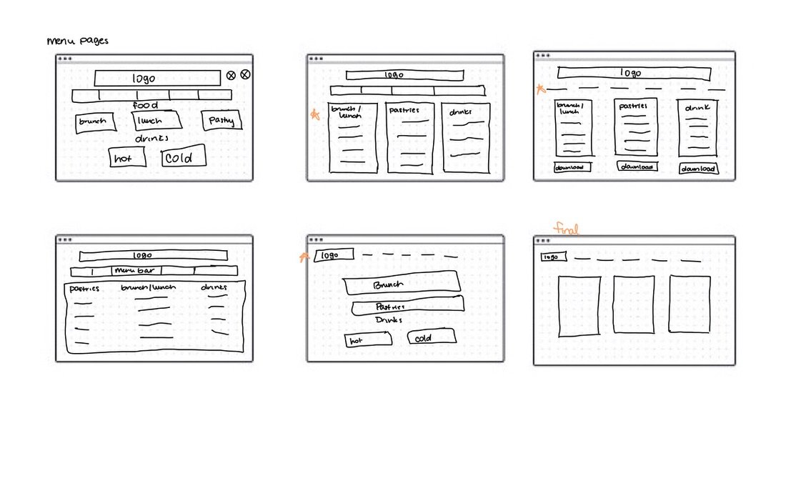
Based on the insights gained so far, I began organizing the content on Revive’s website to meet the project goals. I created low-fidelity sketches for the menu page, focusing on both the desktop and mobile versions. The orange stars next to certain features highlight the elements I found most effective and intended to incorporate into the final design.
Low-Fidelity Digital Wireframes
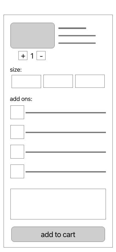
After creating the initial lo-fi wireframe sketches, I transitioned them into digital wireframes using Adobe XD. Throughout this process, my focus was on ensuring that users could quickly and easily access the information they needed, creating a smooth and efficient navigation experience on the website.
High Fidelity Mockups
Using Adobe XD, I transformed the low-fidelity wireframes into high-fidelity mockups, refining the design with detailed visuals, including color, typography, and imagery, to bring the website to life and better reflect Revive's brand identity.
Color Palette
The design for the responsive desktop and mobile site aimed for a minimalistic look that evoked a warm, homely ambiance. I used shades of black and white as the primary colors, with a pop of slate gray throughout the site. These colors were chosen to create a clean, modern aesthetic that aligns with Revive's welcoming atmosphere.
Typography
For typography, I selected Raanana for the logo, menu bar, and headings. This font offers a traditional, minimalist look while ensuring readability. For the subtext, I chose Helvetica Neue for its clean, soft appearance, which complements the overall design and enhances readability.
Final Product
Final Responsive Desktop Website
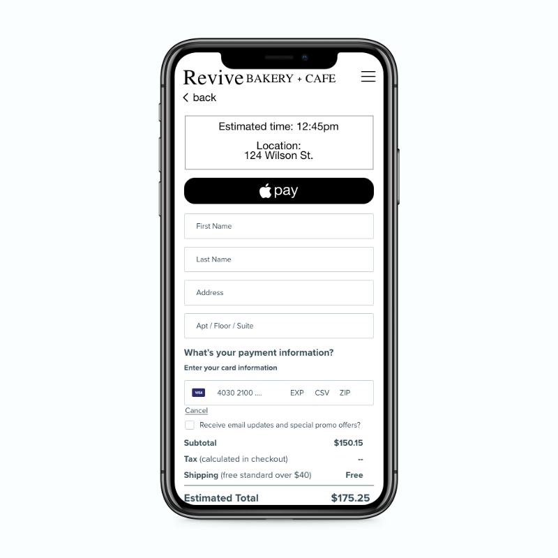
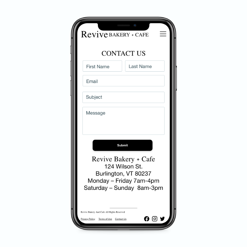
Final Responsive Mobile Website
Takeaway
This case study presented a challenge, as I’m more accustomed to using Figma than Adobe XD. However, I quickly adapted to Adobe XD and found the platform enjoyable to work with. I also realized the importance of iteration—early designs are not set in stone, and refining them through multiple versions is key to effectively addressing user pain points and achieving the best possible solution.


