freshfinds - UX/UI Case Study
Overview
FreshFinds is a grocery shopping app designed to offer users a faster, more seamless shopping experience. The app allows users to easily browse and shop for groceries, save their grocery lists, and store ingredients for recipes, making the entire process more efficient and convenient.
Role
UI/UX Designer (from conception to delivery). My responsibilities included conducting user interviews, creating paper and digital wireframes, developing low- and high-fidelity prototypes, conducting usability studies, ensuring accessibility standards were met, and iterating on designs based on feedback.
The Problem
Shoppers often struggle to keep track of the total cost of items in their cart before reaching checkout. It's also easy to forget which items are on sale. Additionally, grocery shopping can be time-consuming, especially for busy individuals with limited time.
Target Audience
The target audience for this app is individuals aged 18 to 50, particularly those with busy schedules who find it difficult to visit the grocery store. This includes professionals working long hours and students who lack time for in-store shopping. The app is designed for tech-savvy users who are familiar with online shopping and frequently use their smartphones for convenience.
User Research
Goals: The primary goal was to identify shoppers' pain points to create an app experience that is quick, hassle-free, and enjoyable.
To gather insights, I conducted five user interviews, selecting participants through an online forum. These interviews provided valuable data on users’ shopping habits and highlighted the specific pain points that the grocery app aims to address.
Frustrations:
Busy Schedules: Many users struggle to find time for grocery shopping due to their hectic routines.
Distance: Some users live far from their local grocery stores, which makes shopping less frequent and more of a chore.
Time Constraints: The biggest frustration was the lack of time to shop and ensure they were getting the freshest ingredients.
Forgotten Items: Users often forget a few items, leading to either a second trip to the store or abandoning them altogether.
Major Pain Points:
Freshness and Quality: Ensuring that produce is fresh and of good quality.
Time and Distance: Lack of time to visit the grocery store or living far from one.
Forgotten Items: Forgetting items is a common issue, and going back for them isn’t feasible, especially if time is limited or the store is far away.
Cart Total: It’s difficult to keep track of the total cost of items in the cart before checkout.
Sales Awareness: Shoppers often forget which items are on sale while shopping, leading to missed savings.
Design
Low Fidelity Wireframes
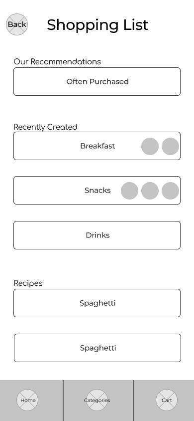
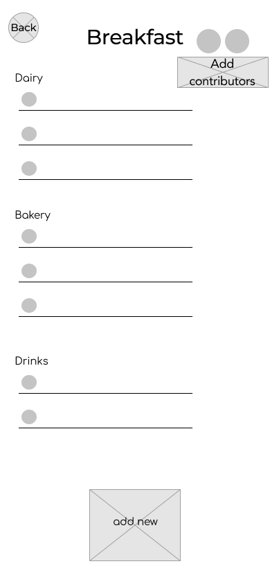
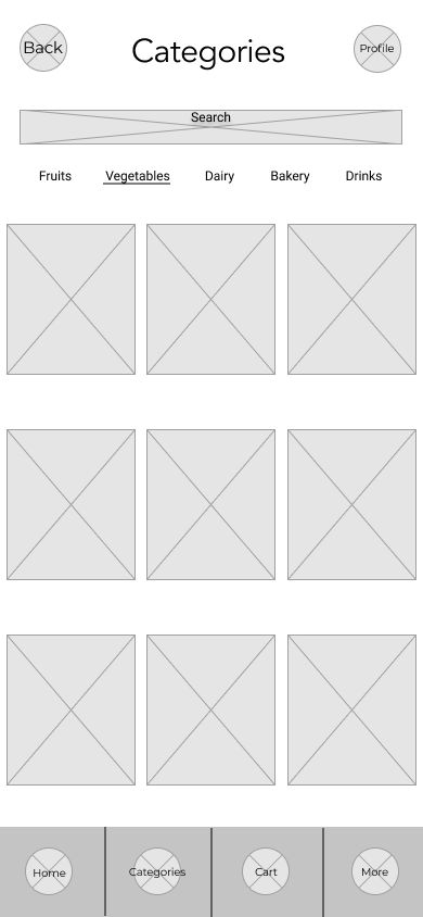
Using Figma, I designed several key screens, including the landing page, sign-in page, profile page, shopping list page, product page, product detail page, shopping cart, and checkout page. I placed particular emphasis on the shopping list and sales pages, as these were the most frequently mentioned pain points in the user interviews.
High-Fidelity Mockups
In Figma, I transformed the low-fidelity wireframes into high-fidelity mockups, refining the design with visual details such as color, typography, and imagery to bring the user interface to life.
Color Palette
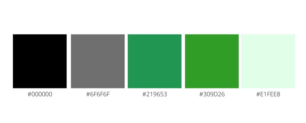
When thinking of a grocery store, the color green immediately comes to mind, as it’s often associated with fresh produce. Green symbolizes growth, renewal, peace, and vitality, making it the perfect choice for this app’s color palette. Various shades of green were selected to evoke these feelings and create a fresh, natural atmosphere throughout the user interface.
Logo
The name freshfinds was chosen to reflect the app’s focus on fresh produce and groceries. The font used for the logo is Assistant Extra Light, which offers a modern, clean look. Above the "F" in freshfinds, two leaves are incorporated to symbolize nature and the freshness of the produce available in the app.
Typography
For the typography, I selected three fonts to create a cohesive and balanced design. Raleway was chosen for headings due to its elegant, well-balanced style. Avenir was used for body text and buttons, offering a crisp and clean look. SF Pro Display was applied to the shopping lists and certain buttons for clarity and consistency. Across the app, I utilized varying font weights, ranging from light to bold, to establish visual hierarchy and enhance readability.
High Fidelity Prototype
Takeaway
This case study reinforced the importance of thorough research. It not only allowed me to empathize with users, but also sparked new design ideas. While the sample size for this project was small, I learned that a larger participant pool would yield more valuable insights in a real-world scenario. Additionally, working on the UI design for freshfinds gave me a deeper understanding of the significance of implementing a design system, which greatly improved both productivity and design consistency.


